
Before the year slips away, I need to introduce you to old faithful.
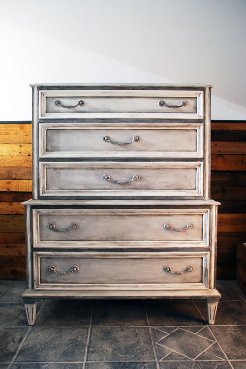
For nearly the whole year, this piece has been with me, so it somehow seems fitting to reveal her now on the last day of the year.
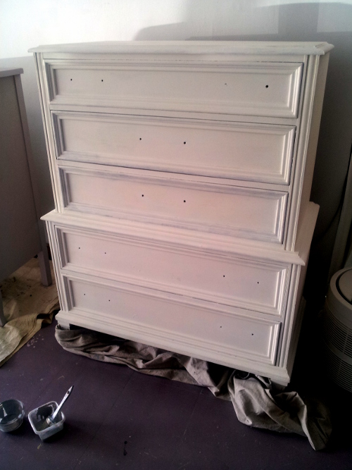
Her life started out with me in late February, when she looked like this:
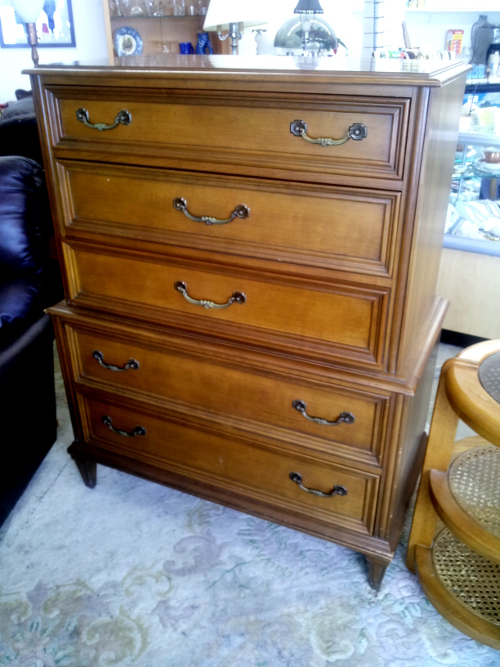
Those with a well-trained eye will notice this is a Gibbard — one of the most respected names in Canadian furniture, but sadly no longer in operation.
Yes, I painted a Gibbard!
Many people think it’s sacrilege to paint a Gibbard. But remember, it’s what’s inside that counts, and that holds true for furniture, too.
What’s important to me is the bones of this dresser — how it was constructed. The original finish had gone orangey, and it really didn’t show any wood grain. Quite honestly, it wasn’t very pretty anymore.
But it’s built like a dream, and withstood the last 50 years without much wear, and will surely survive another 50 or more.
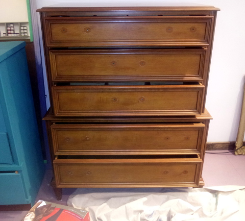
After staring at this piece — unfinished — in my shop for several weeks, but not having a clear idea of what to do with it, I painted it Pure White, for no better reason than these had arrived like this…
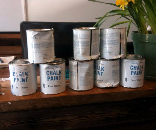
So, I had some extra Pure White on my hands.
Pure White is fantastic, and it’s perfect for those of us who want a bright, crisp white. One thing to know about Pure White, however, is that you’ll need more of it than with most Chalk Paint™ colours. Being a pure white, it doesn’t have any pigment.
As a result, it took 3/4 of a quart. As many of you know, with other Chalk Paint colours, you’d maybe use 1/4 – 1/2 a quart for a piece this size. Not with Pure White. So always ration more when using this shade.
After the base of white, I started picking different areas to highlight. As you can see, I left the trim on the drawers mostly white, but to provide contrast I used darker shades to bring the shape of the dresser out.
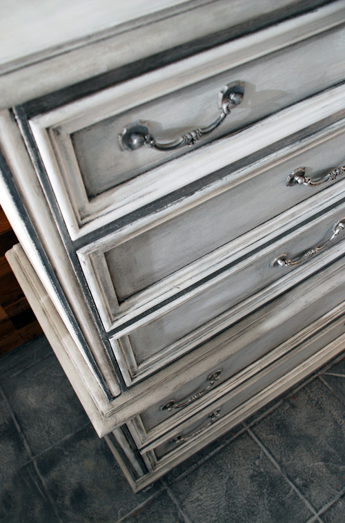
The rim around the top and middle was painted in a mixture of Paris Grey and Old White for a very light grey. The bits around the drawers were done with a Graphite and Pure White combination, so as to really make the white of the drawers pop out.
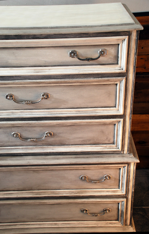
The face of the drawers were painted in Paris Grey, and then I did a wash of Pure White over top.
It’s just the slightest colour change from the Pure White around the drawers, but it makes then sit back, while the Pure White trim pops out.
Then my secret weapon…
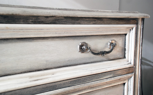
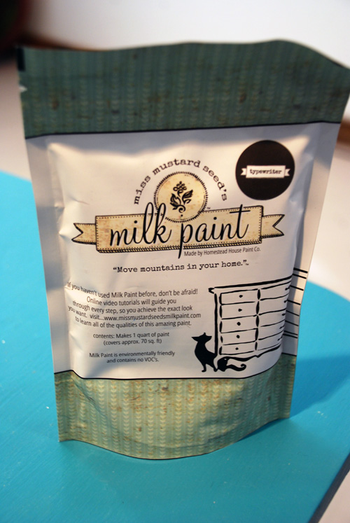
Did you know you can mix different products with Annie Sloan’s Clear Soft Wax to make a coloured wax? My top three choices are mixing Chalk Paint™ into the wax, artist acrylic paint, or pigment powder. In this instance, I used Miss Mustard Seed milk paint powder in Typewriter, a deep black.
The effect was perfect.
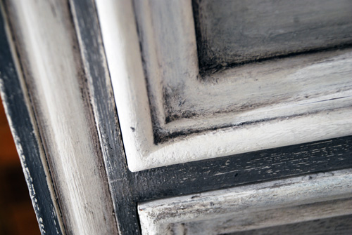
It made a black, gritty wax that sunk in perfectly to the corners. You can see also that I made it thicker and darker deep in the corners, then did it thinner and lighter as I came into the middle of the drawer.
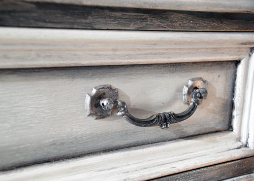
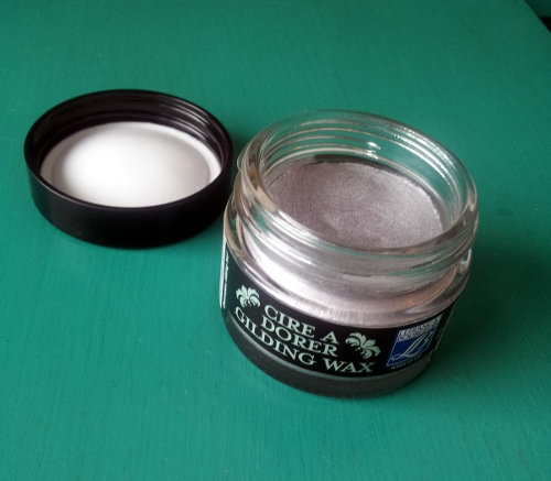
The handles (look at the earlier before picture to see the unsightly brass) were painted first in Pure White, and then I painted them all over in Gilding Wax in Silver. This is the type I use.
I then used my Typewriter/Clear Wax combo on the handles, which took off some of the shininess, and made them look aged like the rest of the piece.
I also gently distressed the piece, but only on the places where I’d painted over the Pure White, as I didn’t want to bring up the wood colour, only the white from the base coat.
So here she is, my Gustavian New Year’s Eve Dream. (She was also my Christmas present to myself.)
This piece garnered so much attention in my shop, that I’m going to have a workshop that specifically teaches this effect. If you think you’d be interested in this, please email me at katrina@malenka.ca.
It’s been a great year here at Malenka Originals and I want to thank YOU for your support, friendship and inspiration. Wishing you the absolutely best for 2014.
Kx