
We’re so excited it’s the first day of Spring. Even if it doesn’t really look it outside (it’s still in the minus digits here in Ottawa, and there’s lots of snow on the ground), we’re still feeling a huge relief that this long, long winter is coming to an end.
Here’s a little bit of spring inspiration to get you in the mood…
I’m asked quite frequently about painting glass with Chalk Paint™, and the answer is absolutely yes! We’ve painted over these glass bottles multiple times. This year it was in a soft palette of pastels, made from mixing various Chalk Paint colours with Pure White.
Top Tip for painting glass — I do a fairly thin coat for my first coat, then let it dry very well (over an hour or more). Then I can start building up my coats, but on glass I don’t like to go too thick.
You can decide to wax or not…waxing will give you a shinier, smoother surface, and also make it a more durable finish.
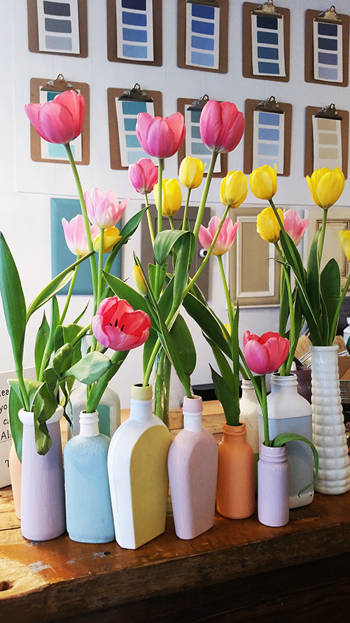
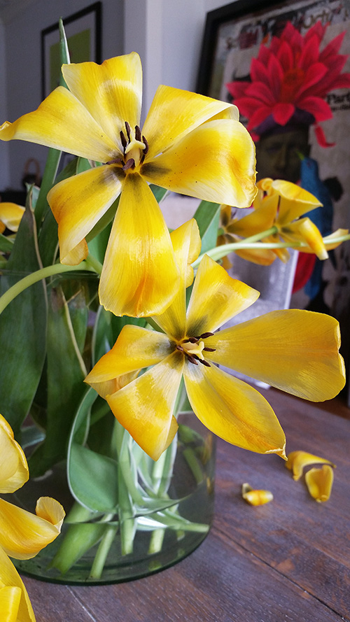
(Tulips are my most favourite flower. It’s largely down to my obsession with everything Dutch, but I also find them to be one of the most emotive flowers around. They way they open, twist around on their long stems, fall gracefully…and even at the very end of their time, as they open dramatically and fully, there’s is something so artful in their presentation.)
I digress! Back to the furniture.
Here are a couple side tables in lovely fresh spring shades…
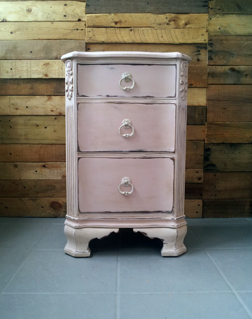
Antoinette is a perfect Spring colour. This piece has pure Antoinette on the drawer fronts, and the body was done with a slightly whitenend shade, by mixing Old White with the Antoinette. It was waxed with Clear Soft Wax and a small amount of Dark Soft Wax. Then lots of distressing around the drawers and along every edge.
This next one is a completely different style…
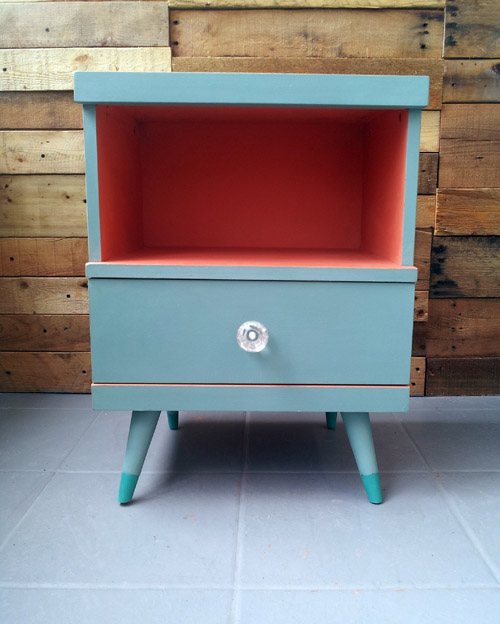
A mid-century piece painted in Provence. The inside is a mix of Old Ochre and Barcelona Orange, which gave me a delicious orange sorbet colour. The legs are dipped in Florence.
Provence is the ultimate Spring and Summer colour…it’s my happy place.
If you find Provence a bit too bright, you might be more of a Duck Egg person.
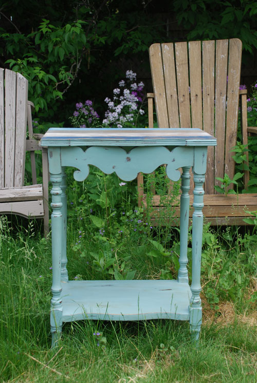
I find Duck Egg to be a hard colour to represent accurately on a computer screen (well, I’m sure you’ve noticed that all colours are!). But this was the closest of my pictures that looks the most true to the original colour, probably because it was taken outside.
Duck Egg has a lot more green in it, whereas Provence has more blue. I also always tell my customers who are trying to decide between the two — if you want to walk into a room and have your piece of furniture really pop out at you, paint it in Provence. If you’d rather it blend in a little more with everything else in the room — sit back a bit — then Duck Egg is a better choice.
And here’s one more, because it’s not a spring pallet without some yellow.
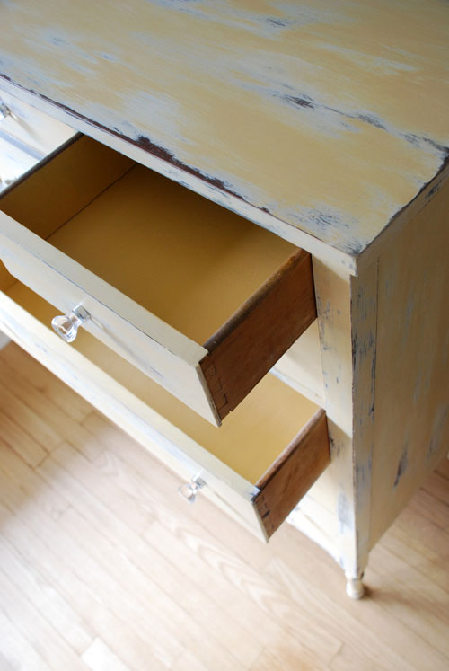
On the outside of this dresser, I first painted Old White, then I did a mix of Arles and Old White to get a soft baby chick yellow. The heavy distressing was done with a wet sponge (always do the wet distressing before waxing).
The inside of the drawers is with solid Arles, for a nice contrast to the distressing.
Have fun with all the soft, beautiful colours of the season. Happy Spring!
Katrina x