
I’ve long been searching for the perfect turquoise.
Florence I — of course — love. But it’s more emerald than turquoise.
It is, however, the closest Chalk Paint™ colour to turquoise, so I knew I’d need Florence to get my perfect shade.
I played with Florence mixed with Aubusson Blue, which is a gorgeous, vibrant blue. But it’s more blue than turquoise.
I’ve mixed various combos of Florence with Napoleonic Blue, Provence, and Louis Blue, which are all lovely.
But then I cracked the Greek Blue and added it to Florence.
And there she was…my perfect turquoise.
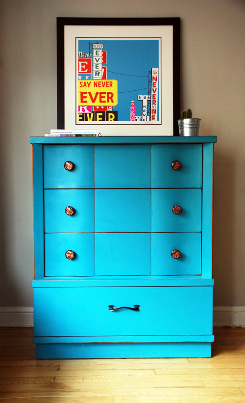
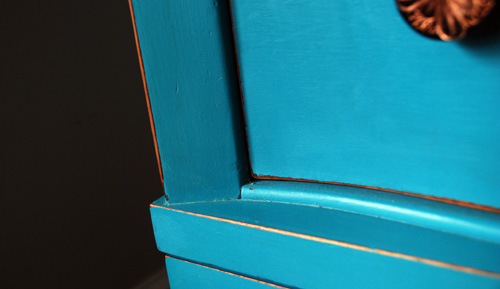
This is a 50/50 mix of Florence and Greek Blue. It is a bright, rich, glorious turquoise.
I know it’s notoriously hard to judge colours on a computer screen. But for comparison’s sake, here’s my Florence telephone table to see how much more green Florence is.

And here’s a piece in Greek blue to compare.
(This was painted by Cristina Maal — Malenka Originals shop assistant extraordinaire. It’s so funky. I bought it from her before it hit the shop floor.)
So, if you look at the Florence and Greek Blue alone, and then the combo, you can really see the best of the two colours in the mixture.
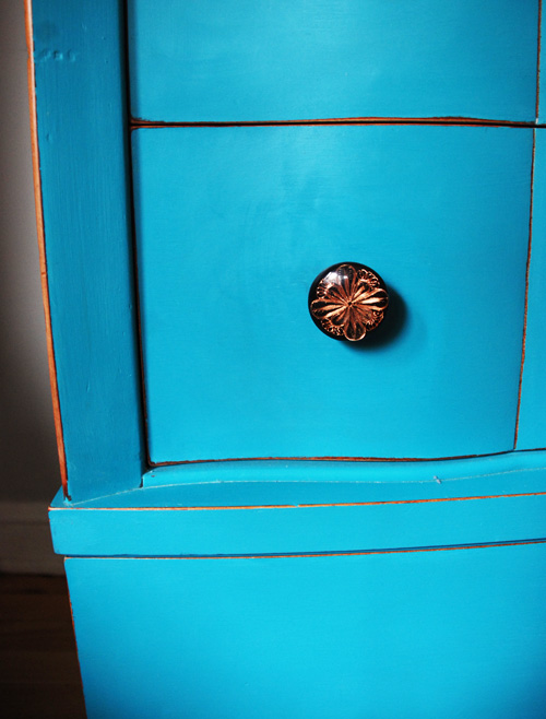
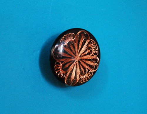
After I waxed with Annie Sloan’s Clear Soft Wax, I did even distressing all around the edges, and was very excited to get this copper colour come through. I had to sand below the old lacquer to get to the colour of the stained wood. Use something rough like 220 grit if you want to distress below the lacquer.
The knobs were bought from Anthropology two years ago, and I was really holding out for the perfect piece. This was definitely it.
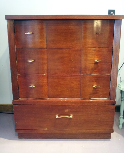
Here’s the before of this piece. I bought it next door at Flashbacks. (Have I ever mentioned how much I love having a used furniture store next door to my shop?)
I’m keeping this piece. How can I not?
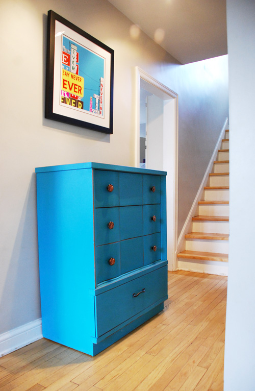
(And look how well it goes with that print! I just had it framed for my husband for his birthday at Wall Space Gallery here in Ottawa. It’s “Never Say Never” by Steve Powers. Great colours. Great message.)
Katrina x